UCLA Online Giving Portal
UX research and full-stack proof of concept for a unified giving portal — consolidating three UCLA donation platforms into one cohesive donor experience
Overview
UCLA's online fundraising ecosystem spans three separate platforms — GiveToUCLA campaign sites, giving.ucla.edu, and department-level microsites — each maintained independently and incompatible with one another. The result is a fragmented donor journey, siloed fundraising data, and a growing backlog of maintenance debt for the technology team.
To explore what a better giving experience could look like, I conducted UX research with donors and advancement staff across UCLA's existing giving platforms, then used those insights to design and build a proof-of-concept unified Online Giving Portal. The POC was built full-stack — integrating Stripe for payment processing and using an AI-assisted development workflow — to validate the technical approach alongside the UX design. This is not a launched product; it is a working prototype intended to demonstrate feasibility and inform future investment decisions.
The Problem
- Donors encountered three different visual identities and checkout flows depending on the fund they wanted to support
- Gift officers had no unified view of donor activity across platforms, making stewardship difficult
- Mobile conversion rates lagged significantly behind desktop due to outdated form patterns
- Campaign pages required IT involvement to launch, creating weeks-long delays for advancement staff
- Payment methods were limited — no Apple Pay, Google Pay, or recurring gift options
My Role
Sole Product Designer and UX Researcher on the proof of concept. Led stakeholder research, conducted moderated usability tests with UCLA donors, mapped the full giving journey across three platforms, and designed high-fidelity mockups from discovery through development. Built the POC full-stack — integrating Stripe for payment processing using an AI-assisted workflow — to validate both the UX design direction and technical feasibility alongside the product design.
Users
Two distinct user groups shaped the design direction:
Front-end (UCLA Donors): Alumni, parents, faculty, and major donors — ranging widely in technical ability and giving history. The experience needed to feel trusted, fast, and brand-consistent on mobile, where conversion rates on existing platforms lagged significantly behind desktop.
Admin side (UCLA Advancement Staff): Gift officers and campaign managers who needed a self-service tool to launch campaign pages, monitor giving activity, and manage fund configurations — without waiting weeks for IT involvement.
Research & Process
1. Discovery & Stakeholder Research
Ran a series of stakeholder interviews across Advancement, IT, and the gift officer community. Mapped the existing giving journeys across all three platforms end-to-end, identifying the critical drop-off points and the administrative pain points that were slowing campaign execution. Key insight: advancement staff wanted a self-service campaign tool just as much as donors wanted a faster checkout.
2. Competitive Analysis & Benchmarking
Analyzed online giving portals from peer institutions (Michigan, Stanford, Harvard) alongside leading e-commerce patterns. Identified best-in-class patterns for fund discovery, recurring gift configuration, and campaign landing page design that could be adapted within UCLA's brand system.
3. Information Architecture & User Flows
Rebuilt the information architecture from the ground up — mapping the portal into four core experiences: Fund Discovery, Giving Form, Checkout, and Campaign Management. Created detailed user flows for both the donor path and the admin path to ensure neither was treated as secondary.
4. Wireframes & High-Fidelity Design
Designed wireframes for all major screens and iterated rapidly with feedback from gift officers and the development team. High-fidelity mockups followed UCLA brand guidelines while introducing a cleaner, more trust-building visual system — particularly on the checkout and confirmation screens where conversion rates were most at risk.
5. Usability Testing & Iteration
Conducted moderated usability tests with eight donors recruited through UCLA Alumni Affairs. Key iterations included simplifying the fund search experience, reducing the number of steps in the recurring gift setup, and improving error state clarity on the payment form.
Research Findings
- Research with existing UCLA donors revealed that donors were dropping off before completing payment on the current giving platforms, particularly on mobile — validating the need for a simplified, mobile-first checkout experience.
- Gift officers cited "waiting for IT to build a campaign page" as their #1 pain point — average wait time was 3–4 weeks per request
- Donors expressed hesitation on the payment screen due to unfamiliar platform branding; aligning checkout with UCLA's primary brand identity measurably increased perceived trust in follow-up surveys
AI-Assisted Design Process
This project was an early example of integrating AI tools into every stage of the design process — not just for speed, but to improve the quality of research synthesis and stakeholder communication.
Research Synthesis
Conducted user interviews with UCLA donors and giving platform users, then used Claude to synthesize interview notes into key themes, pain points, and opportunity areas — reducing analysis time significantly while surfacing insights that might have been missed manually.
BRD Creation
Instead of manually writing a Business Requirements Document from scratch, used Claude to fast-track BRD creation from interview notes and requirements sessions — producing a comprehensive document that was shared with senior leadership and the engineering team.
Rapid Prototyping with Figma Make
Used Figma Make to rapidly prototype the giving experience in alignment with UCLA brand guidelines and real user requirements gathered from interviews — enabling faster iteration and stakeholder feedback cycles.
Interactive POC for Senior Leadership
Built a fully interactive proof of concept using Claude Code that senior leadership could actually use and interact with — replacing static wireframes with a working prototype that demonstrated the full donation flow, fund selection, and giving options. This created significant excitement and accelerated executive buy-in.
Key Design Decisions
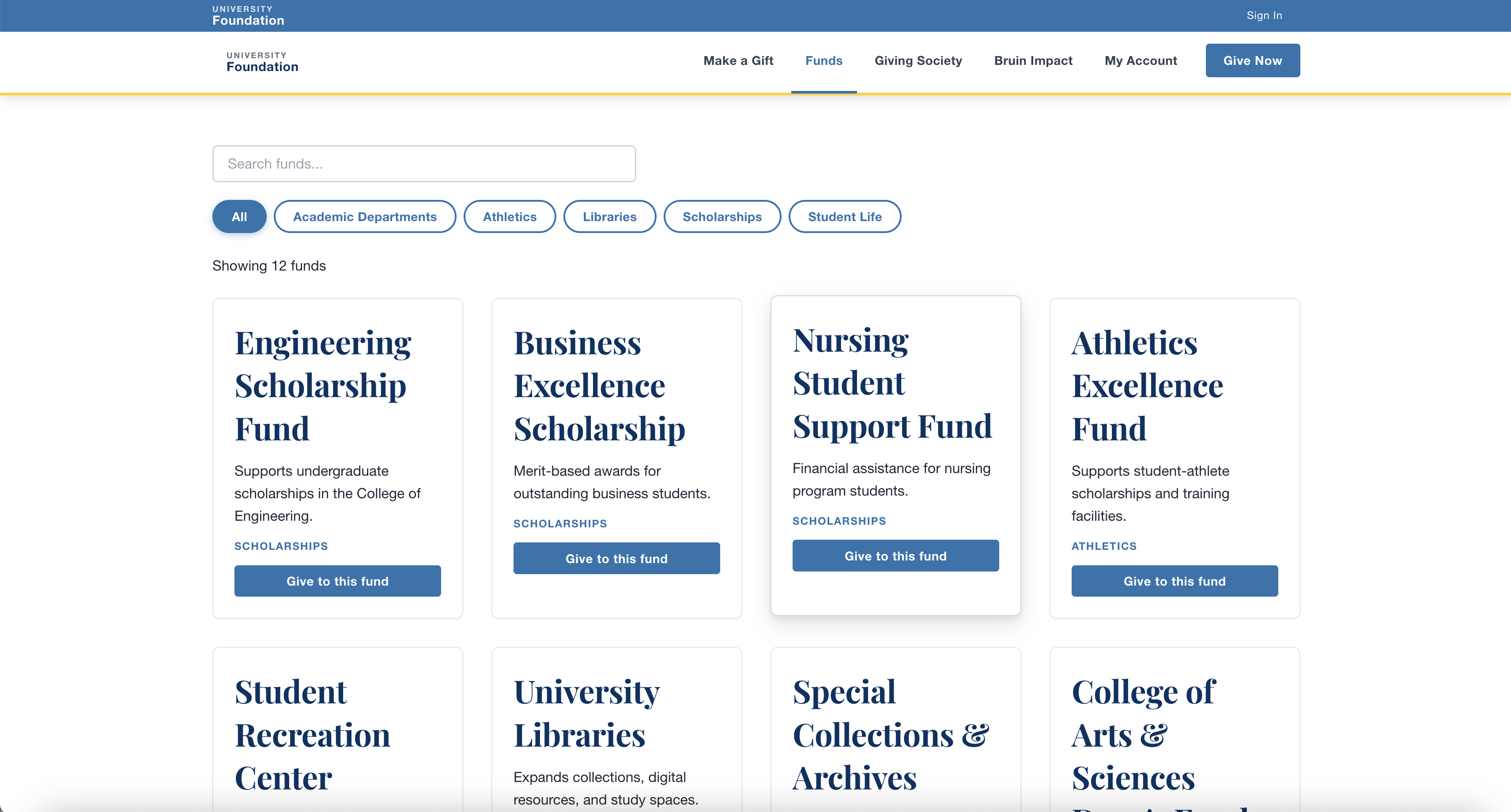
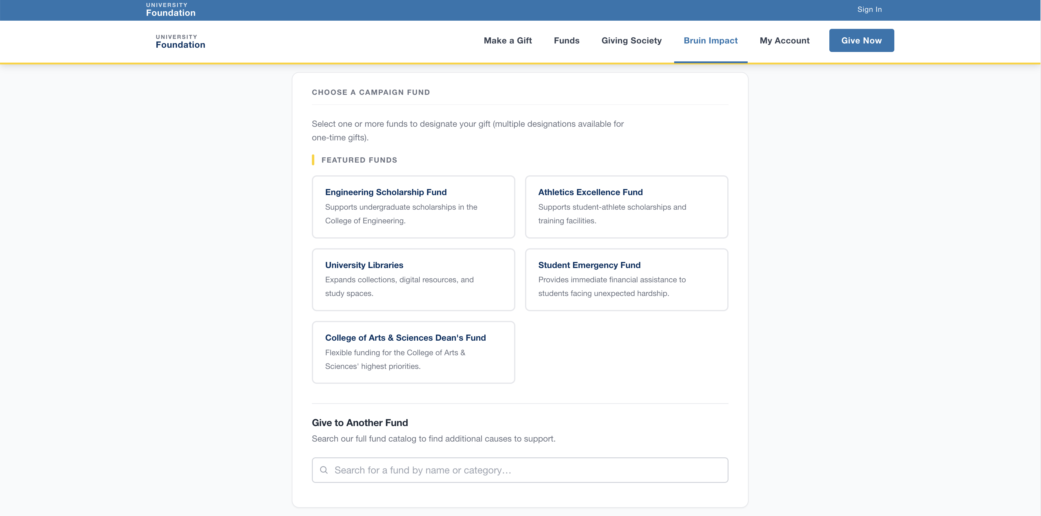
The central challenge was designing a portal that felt fast and trusted for donors while giving advancement staff genuine self-service autonomy. The trickiest design problem was fund discovery architecture — donors could arrive from a campaign with a specific fund in mind, while others needed to browse freely. Designing a search and filter system that served both paths within a single checkout flow required several rounds of usability testing before it clicked.
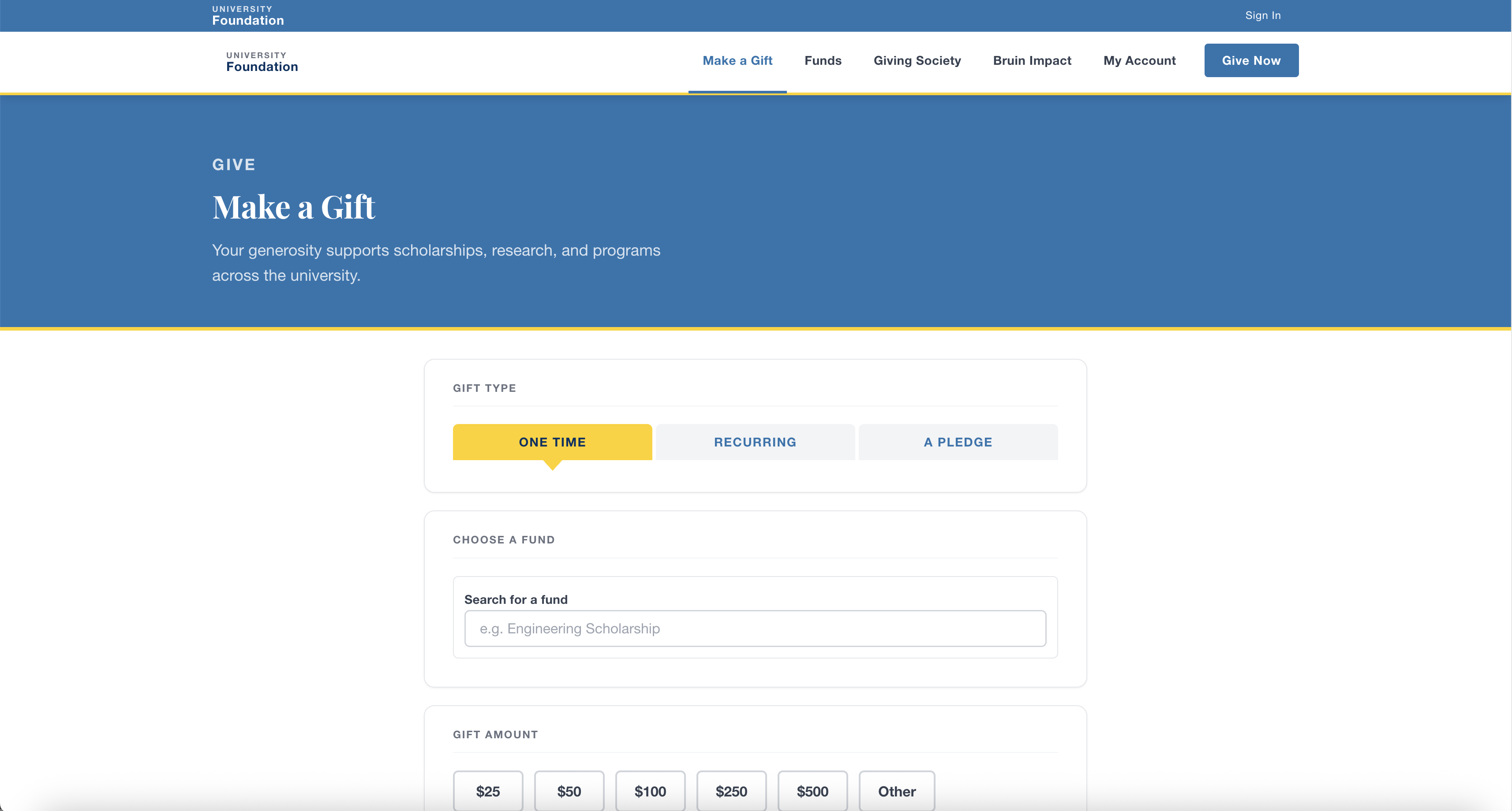
The checkout and payment screen were the highest-stakes screens in the product. Research showed that donors hesitated when the checkout environment didn't visually match UCLA's primary brand. Rebuilding trust signals — consistent logo placement, UCLA color system, familiar layout patterns — measurably improved perceived legitimacy in follow-up usability surveys.
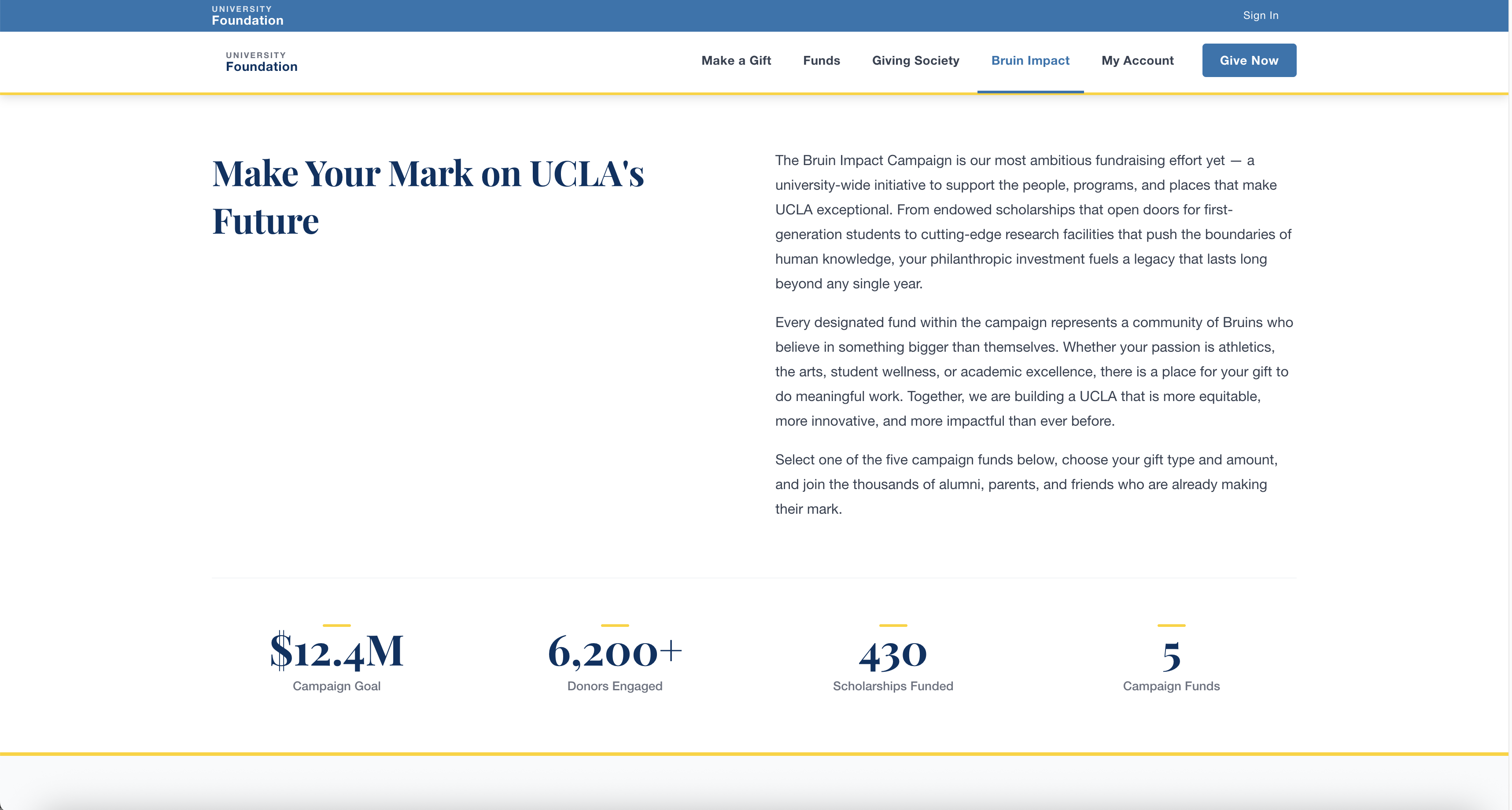
Platform Screenshots
What Was Built
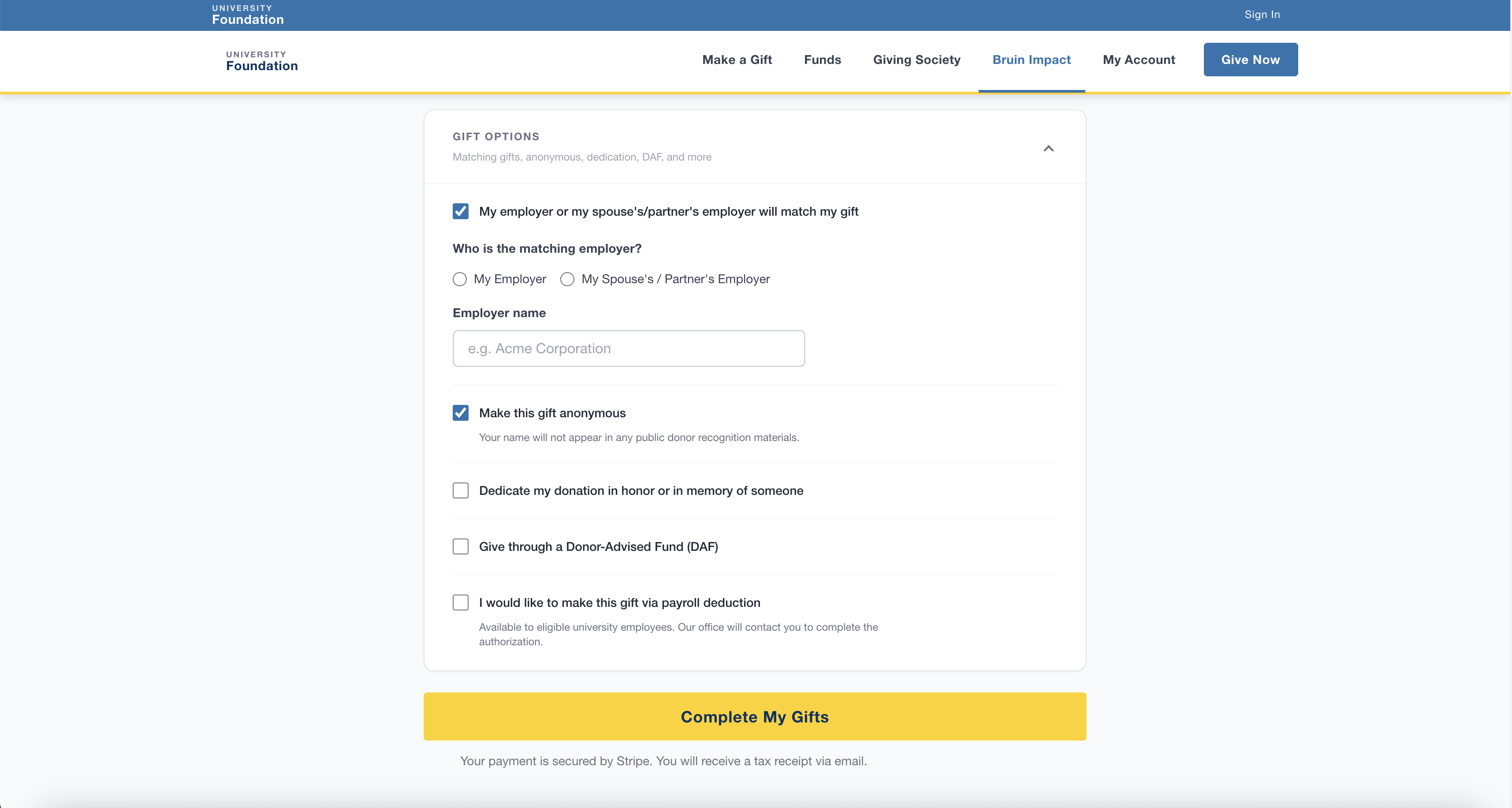
The proof of concept demonstrates a viable path toward consolidating UCLA's three giving platforms into a single, cohesive donor experience. The full-stack POC — built with Stripe payment integration and an AI-assisted development workflow — validates both the UX design direction and the technical feasibility of the approach. Research conducted with donors on UCLA's existing platforms confirmed that the unified checkout, mobile-first design, and self-service campaign builder directly address the friction points that currently suppress conversion and increase IT workload.
Results
- UCLA's existing giving infrastructure processes over $50M in annual gifts across fragmented platforms — this POC presents a design and technical foundation for consolidating that volume into a single, higher-performing experience
- The project has not been launched to production and represents a design and technical proposal for future investment